Catling is a graphic designer from Essex, United Kingdom. The artist draws his inspiration from his surroundings. Using from old war photos to images of landscapes and monuments, Catling creates bright contrasting works. The funky details the artist adds, completely change the essence of both new and old black and white photos.
Catling started by cutting out snippets from newspapers and magazines and mashing them together to create different art pieces. Now that he has graduated from paper cuttings, permanent markers and other media, he has ventured into digital art to transform vintage photos into edgy pop art collages.
Catling started by cutting out snippets from newspapers and magazines and mashing them together to create different art pieces. Now that he has graduated from paper cuttings, permanent markers and other media, he has ventured into digital art to transform vintage photos into edgy pop art collages.


Commenting on issues like war, terrorism and male dominance, Catling gives these photos a brighter, more cheerful take on their content and their history. With their floral appearance, these botches freshen up the images and their characters and add a lot of fun in them. The hippie notion of replacing guns with flowers is the main theme of these photos, in which the added details make even the shadiest character look like a lovely person. Apart from experimenting a lot with collages and designing, the young designer, who is always creating unique and minimal works, also takes photos of urban and exotic scenery.
The artist starts by gathering black and white vintage photos on the Internet. He then adds his quirky brand of patterns, shapes and illustrations into the cut-out parts. The resulting images are eclectic and hip at the same time. From dapper gentlemen draped in the latest woven patterns, to military men in flowery uniforms and helmets, Catling’s handiwork adds a youthful contrast to the monochrome images.
The artist starts by gathering black and white vintage photos on the Internet. He then adds his quirky brand of patterns, shapes and illustrations into the cut-out parts. The resulting images are eclectic and hip at the same time. From dapper gentlemen draped in the latest woven patterns, to military men in flowery uniforms and helmets, Catling’s handiwork adds a youthful contrast to the monochrome images.
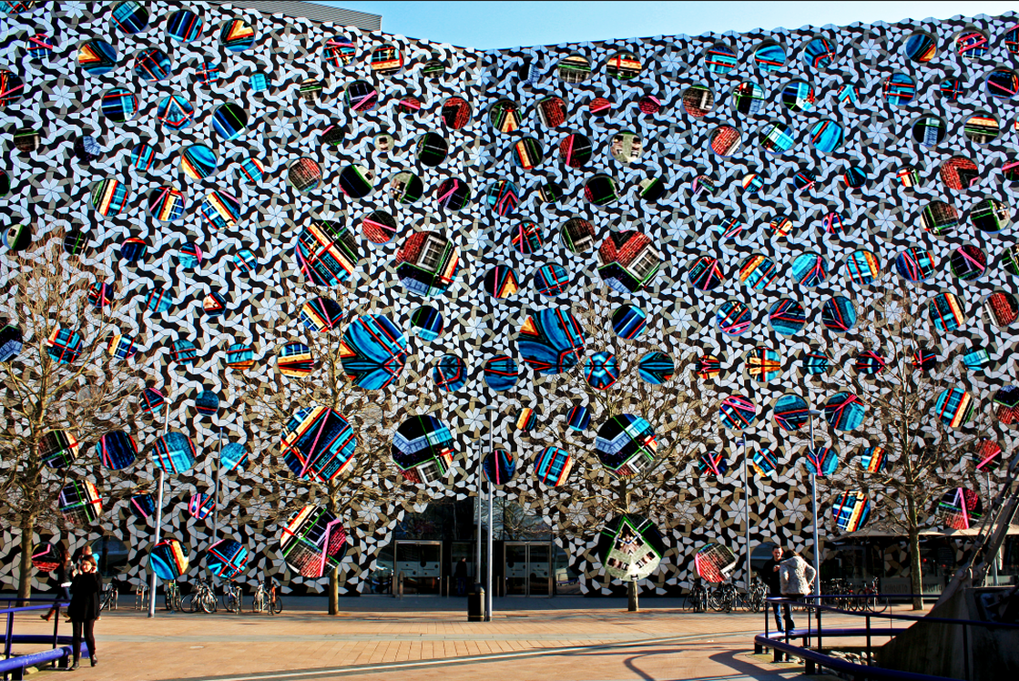
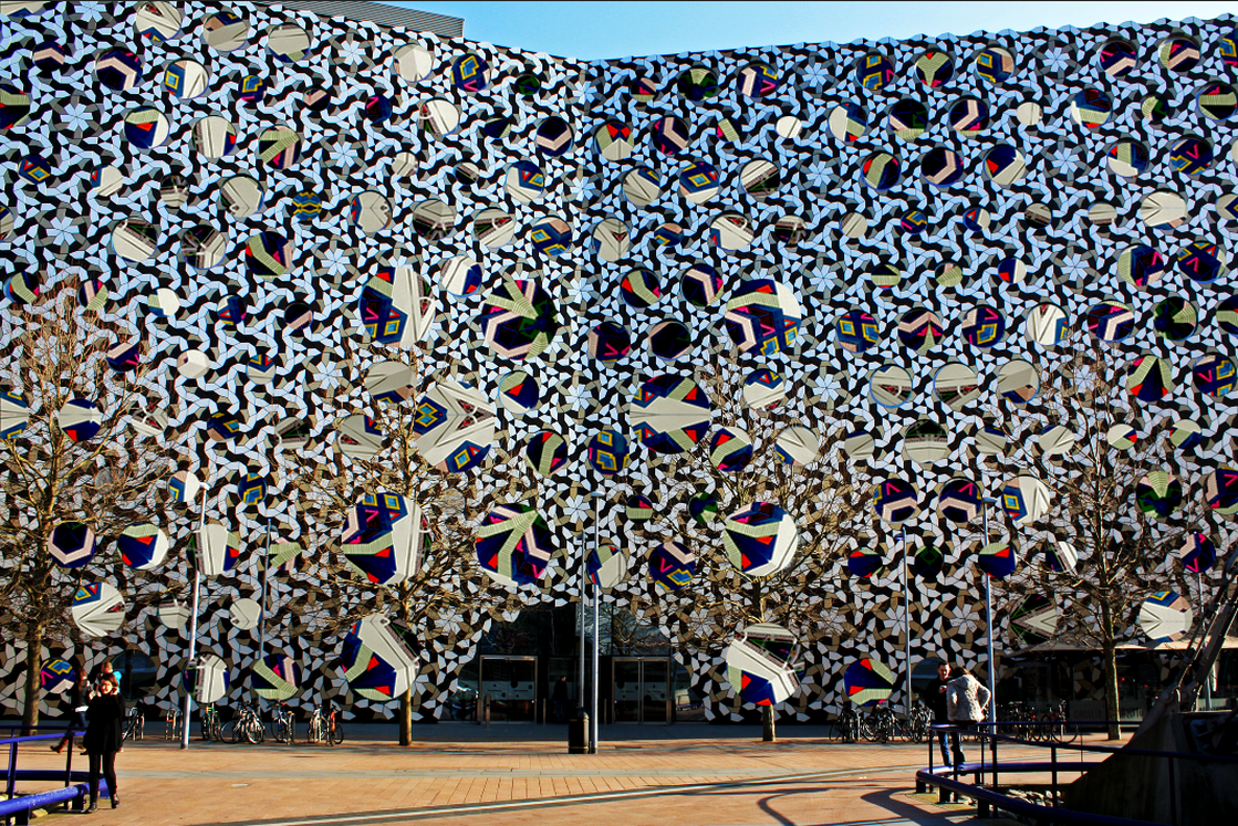
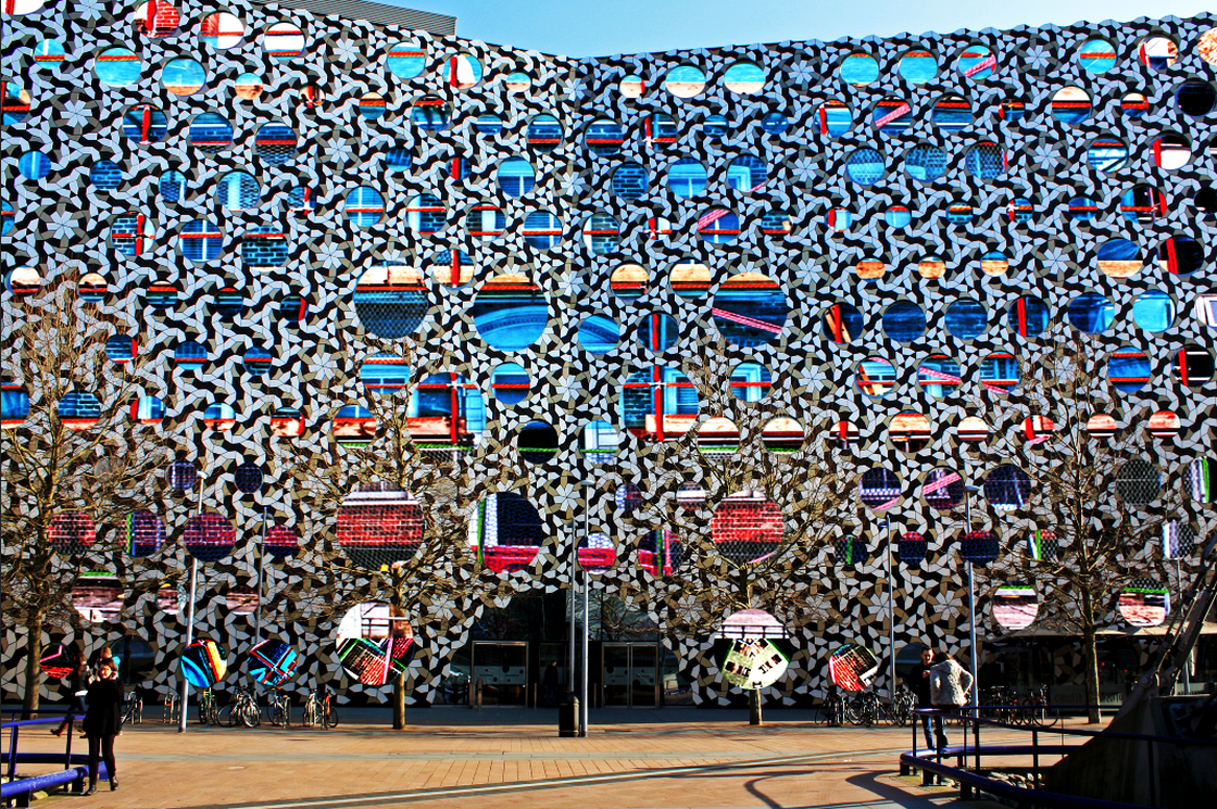
In response to Guy Catling, I created a handmade response and another one using Photoshop to use different materials and test which one works better and looks more effective. For the first response I chose an image of a building near the O2 from my photo-shoot, I then used the circular selection tool to select all the windows and cut it all out. Later on I chose to use my kaleidoscope pattern of the building that was under construction to represent a journey of how buildings are built. I used the layer under the image of the building to cover the blank window spaces. Through combining many different materials (embroidery thread and kaleidoscope patterns) and the bright colours, the image looks very busy. There is a lot of pattern going on because of the mosaic on the building and the bricks on the other image, it is difficult to concentrate and tell what is going on. therefore I decided to use the original image that does not have the kaleidoscope effect on so that it can look simpler.
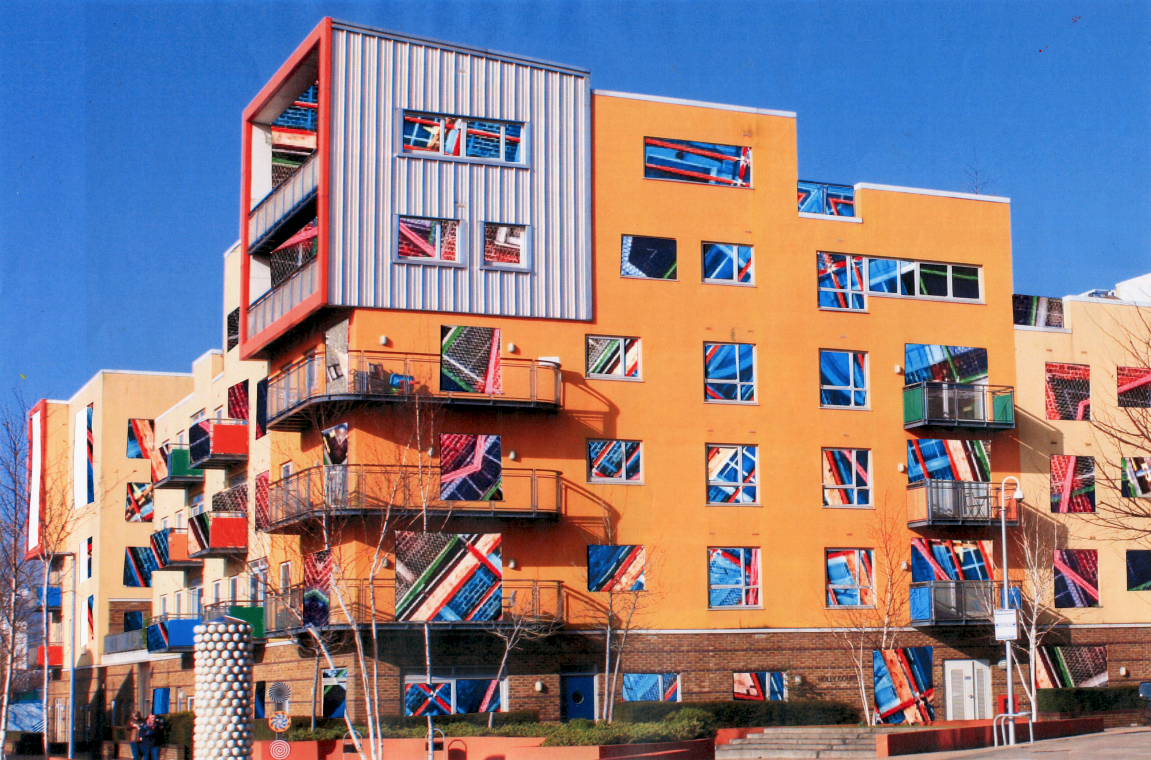
For this response I tried using a different technique to achieve a similar outcome to Guy Catling to see whether it would have a completely different result. I used a less complicated building from millennium village because I'm going to be using a more complicated pattern where the windows are. I began by using he carving knife and a mat to cut out the windows and the sections that I didn't want such as the doo. I then placed the image underneath, I experimented with different patterns but this was my favourite one that worked well. Even though I like the combinations of the colours, I could've made the building image into black and white so that the main focus could be on the patterns.
